User Interface for Solid Edge with Synchronous Technology – Part 1
Warning: Use of undefined constant home_feature_photo - assumed 'home_feature_photo' (this will throw an Error in a future version of PHP) in /home/synchron/public_html/blog/wp-content/themes/WP-MagTheme10-Prem/single.php on line 70
Many questions have been raised both on and off line regarding the user interface for Solid Edge with Synchronous Technology. So this is the first part of several posts on this subject to address these questions.
Siemens PLM Software licensed the Microsoft Office Fluent user interface for Solid Edge with Synchronous Technology. Microsoft Office is one of the most widely used software products in the world. Following Microsoft’s lead ensures that users are interacting with a familiar system and not having to learn or cope with a customised interface. The only difference is in the colour scheme with Solid Edge using a silver grey colour rather than the Microsoft’s traditional blue.
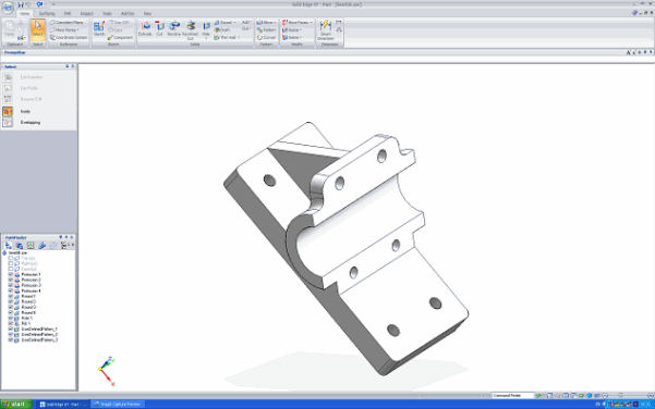
Concerns have been voiced about the available model area with the new interface. The height of the screen area available for the 3D model is only about 5% less than that with the previous Microsoft XP interface. However if you previously worked with large buttons, or buttons with text there is now more screen height and width in the model area.
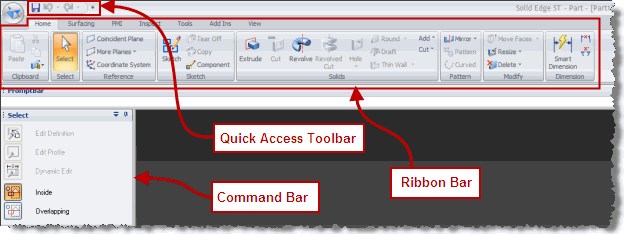
These are some of the key elements of the Microsoft Office Fluent interface.
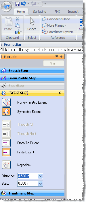
One of the unique and extremely useful features of all previous versions of Solid Edge was the SmartStep ribbon bar. This is now called the Command Bar and by default appears on the left had side of the interface as a docking window, essentially a vertical SmartStep ribbon bar.
You can see that the clarity has improved and the addition of text with icons makes the interface even easier to use.
Everyone will have their own opinion about the Microsoft Ribbon Bar but from my experience with use it grows on you. If you wish to customise the interface you can add any command to the Quick Access Toolbar by simply right clicking on the command and selecting the appropriate option. No more Tools, Customize etc. Microsoft do not allow the Ribbon Bar to be customised at present.
The way keyboard commands work is a big improvement. By pressing the Alt key this now switches on keyboard input and displays all the keyboard shortcuts that you can then select. Keyboard shortcut input remains active and still highlights the available shortcuts until Alt is pressed again or a screen selection input is required. This makes it far easier to navigate between menus.
So in summary the advantages of using the Microsoft Office Fluent interface for Solid Edge become apparent with extended use.
This allows you to become more productive and efficient with Solid Edge.
If you would like to understand more about the Microsoft Office Fluent interface please look at the pages located here.
Keep an eye open for Part 2 of this post or subscribe to our feed for automatic notification.


