Solid Edge ST3 Interface Enhancements
Warning: Use of undefined constant home_feature_photo - assumed 'home_feature_photo' (this will throw an Error in a future version of PHP) in /home/synchron/public_html/blog/wp-content/themes/WP-MagTheme10-Prem/single.php on line 70
We have been seeing some really positive information creep out with regards to Solid Edge ST3 which is due to ship later this year (probably October). What appears to be happening is that Siemens really seem to have been listening to their customers recently. This is testament to the number of customer driven enhancements that are being introduced with ST3. This is very positive for the future of Solid Edge and its community – something we are passionate about here.
There is still some fantastic ST3 technology that we still cannot talk about until the official launch announcement from Siemens. But, over the next few weeks, we’ll cover some of the more high level enhancements. We’ll start today with some of the interface changes.
When the first version of ST was released back in August 2008 with its shiny new Office 2007 look and feel, it received both positive and negative responses from existing Solid Edge users. This can be expected following any major change to the GUI on any application. Some of the more long term Solid Edge power users felt it slowed them down and certain tasks just required more mouse clicks. In addition to this people felt that the Command Bar (which used to be the slick Smart Step Ribbon Bar in V20) took up too much space and interfered with the EdgeBar.
Solid Edge ST2 took some small steps in a positive direction with the introduction of a wide screen format which meant more commonly used commands were on the main ribbon This meant not having to switch to the other ribbons quite so often.
However, it looks like the interface changes in ST3 just about tick all the boxes for all users whether they be experienced or not. We have already covered in a previous post the fact that ST3 will now have the Office 2010 capability to completely customise the command ribbons so that users can put commands wherever they like.
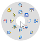
One other thing that the above post alluded to was the possibility of a radial menu, although information on this was lacking at the time. We can now say that there WILL be a fully customisable Radial Menu that will be invoked with a simple right mouse button drag. It is completely customisable and will hold 16 of your most commonly used commands. The customisations can be easily distributed to other machines and be maintained during product upgrades in the future. An example is shown below.
Radial Menu

Something that will really please some of the more experienced users is the re-introduction of the ‘V20 like’ Smart Step Ribbon Bar which will be used by default instead of the ST2 Command Bar. However unlike V20 this new Ribbon Bar operates in a similar way to the QuickBar in the Synchronous environment in that it can be positioned anywhere in the graphics window or be magnetically stuck to the window boundary. More importantly it frees up valuable space for the PathFinder and takes up minimal space in the graphics area too. There is an optional vertical representation that can be switched on if necessary. This will probably be useful for new users as it provides additional feedback.
Smart Step Ribbon Bar

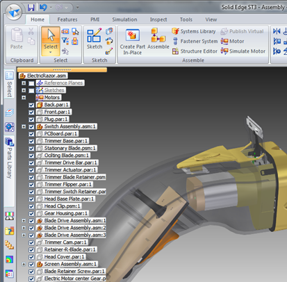
Another enhancement focused at freeing up precious graphics space is the introduction of a transparent mode for the pathfinder as shown in the image below. This too can float around the display or can be magnetically stuck to the window boundary like the Ribbon Bar. Importantly since it has the transparent background it enables geometry to display and be located through it, this allows for a much larger graphics area.
Transparent PathFinder

The Live Rules panel in the Synchronous environment also sees some similar attention and now boasts a ‘Heads-up Display’ which has improved visual feedback. When the Live rules are needed they pop up in the graphics window in a floating UI. Since this allows the EdgeBar to be collapsed this too frees up more graphics area.
Heads-up Live Rules

Some final interface enhancements worthy of note are the new on screen edit handles which are appear when features are selected, The switch windows command now shows thumbnails instead of just filenames and the close / save dialogue also displays thumbnails.
Edit Handles and Thumbnails

Until next time
Top Edging
Jon Sutcliffe
Why not visit Solid Mastermind THE Community for Solid Edge Professionals.
For more information please take a look at the about page.


